|
|
| Example of POP typeface |
|---|
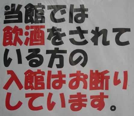
The POP shotai (ポップ書体) or "Point Of Purchase" typeface is often used for shop signs. It is meant to replicate the look of characters drawn with a felt-tip pen. Shop assistants may also take courses on how to write characters in this style.
eishotai (映書体), sukuriin moji (スクリーン文字), shinema shotai (シネマ書体) or eiga moji (映画文字) is the style of writing used for movie subtitles. The letters are, or were, actually written by hand directly onto the 35 mm film by specially trained people called "title writers". The actual characters are less than one millimetre in size, and the special look of this style, and its heavy use of abbreviated kanji forms, are due to the restrictions imposed by space.
Copyright © 1994-2026 Ben Bullock
If you have questions, corrections, or comments, please contact Ben Bullock or use the discussion forum / News / Privacy policy

|

|
|

|
|
| Book reviews |
Convert Japanese numbers |
Handwritten kanji recognition |
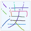
Stroke order diagrams |
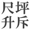
Convert Japanese units |