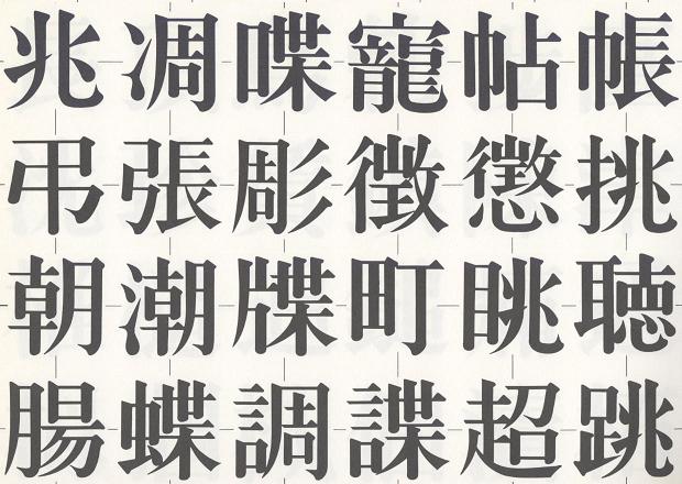
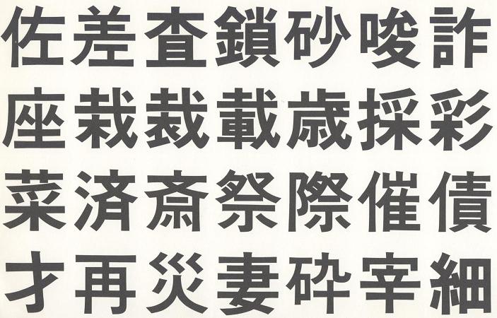
Minchō (明朝体) or "Mincho" is the classic printed style. Minchō means "Ming dynasty". The original formation of this typeface was as woodblocks. This type style is characterized by
It is said that the thick vertical lines were to prevent cracking in the woodblocks, since the grain of the wood went vertically. This style is called sōtai (宋体) in China.
Shimbunshotai (新聞書体), used for newspapers, is a variant of the Minchō font designed for readability at small scales.
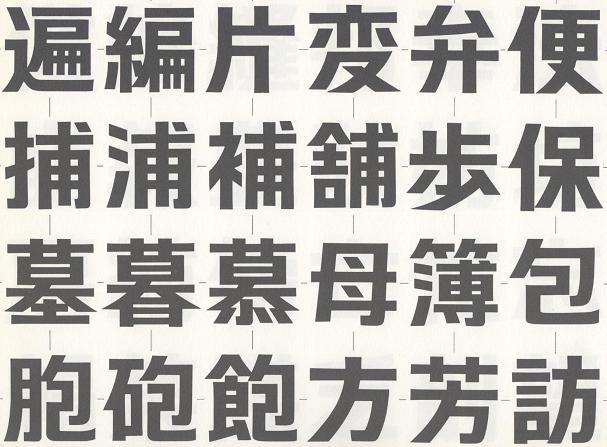
The Goshikkutai (ゴシック体) style is similar to sans-serif type in English. The name goshikku is derived from English "gothic", but it has very little in common with "gothic" type in English. In the past, the word "gothic" was used to describe sans-serif typefaces. This meaning, "sans serif", has been preserved in the Japanese usage.
Marugoshikkutai (丸ゴシック体) "maru gothic", or "round gothic", is a development of the Goshikku (Gothic) typeface with rounded corners (Japanese maru (丸) means "round") on the kanji.
Maru gothic typeface is commonly used for signs. Japanese road signs usually use white maru gothic on a blue background. The typeface is also often used for advertising signs. It is not commonly used for printed text.
Kyōkashotai (教科書体) was created in the Meiji period (1868-1912) for use in primary school textbooks (kyōkasho (教科書)). It resembles hand-written characters. It is a variant of the kaisho style made easier to read. This style is also used in the "Genki" textbook series for learning Japanese.
Copyright © 1994-2022 Ben Bullock
If you have questions, corrections, or comments, please contact Ben Bullock or use the discussion forum / Privacy policy

|
|
|

|

|
| Book reviews |
Convert Japanese numbers |
Handwritten kanji recognition |
Stroke order diagrams |
Convert Japanese units |