Used under a Creative Commons licence.
|
|
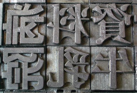
| Metal kanji for printing |
|---|
|
Photo credit: Matt Smith
Used under a Creative Commons licence. |
In the same way that there are various ways of writing English, both in handwriting and in type, Japanese has many different ways of being written.
There are two main styles of writing Chinese characters,
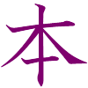
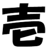
A variant of traditional Chinese forms is Edomoji (江戸文字), Japanese calligraphic forms created during the Edo period (1603-1867).
Thanks to Jeff Schrepfer, Kouji Ueshiba, and seto-san for help with this entry.
Copyright © 1994-2026 Ben Bullock
If you have questions, corrections, or comments, please contact Ben Bullock or use the discussion forum / News / Privacy policy
|
|
|

|

|
| Book reviews |
Convert Japanese numbers |
Handwritten kanji recognition |
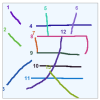
Stroke order diagrams |
Convert Japanese units |